
Game Design Journal #2
Progress: The Demon is in the Details.
Drawing out some hexes for the game’s map. Pen and ink is one of my favorite mediums!
The path leading from my initial impulse to create a board game to its actual execution is complex and requires many steps. I’ve embarked on numerous projects in the past, from recording albums of music to writing, illustrating, and publishing my own children’s book. Yet I still manage to approach large endeavors with a naive kind of optimism that completely disregards the multitude of details that emerge once things are underway. Reflecting on it now, I recognize this as a strength - my sheer enthusiasm for creating something I’m passionate about gives me momentum to speed along, and not get bogged down by the logistics.
In the process of working on Demonhand, I’ve found my excitement for the artwork I’m creating has kept the creative fires burning brightly. Artwork aside, there are many questions that now arise to be answered:
How large will the map be? How will it be printed?
How will I source components? What will their costs be?
How can I produce a high-quality product while also making sure the game is financially accessible?
How can I make sure it’s actually enjoyable?
I’ve even gone as far as sourcing and pricing Ziploc bags for the game and its components. Funny to see how “I’m going to design a game” eventually leads to an extensive search for bags of the -perfect- dimensions.

A test version of how the game’s finished hexes might look. Certainly a bit more psychedelic than the muted, pastel tones of many historical wargame maps. I’ll be taking all the queues I can from those tried-and-true designs to make sure I’m presenting the play area and relevant information in an easy-to-parse, visually inviting way.
I find myself applying my imagination not only to the artwork and world of Demonhand, but also to the logistical details of production and publishing. For example, the game’s map - many old-school hex and counter games come with a poster-sized map printed on paper of varying thicknesses and qualities. Some of these are absolute works of art, blending a sumptuously visualized landscape with game iconography, reference charts, and more.
I’ve struck upon an idea that could prove a great option for a durable yet svelt map surface. I’m keeping this a secret for the time being, as I have yet to test my hypothesis. I will eventually share my cunning plan, whether it is successful or not.
In any event, progress is being made. A form is taking shape out of the ethers of my imagination. Demonhand certainly has a life of its own, and my job is to guide its form as best I can. That and shopping for Ziploc bags.
A look at some prototype printed counters. Definite room for improvement, but things are off to a promising start.

Prototype counters were printed at my local Staples and mounted on chipboard. Even with the slightly-crappy print quality, I could tell that I needed to clean up the iconography appearing on my counters - some of the illustrations were blurry and hard to grok. Thus, I distilled my initial counter illustrations into simple, crisp silhouettes. I’ll be getting the next round of counters printed by the manufacturer I plan to use when I present this game on Kickstarter, so hopefully, my changes are sufficient. We’ll see.
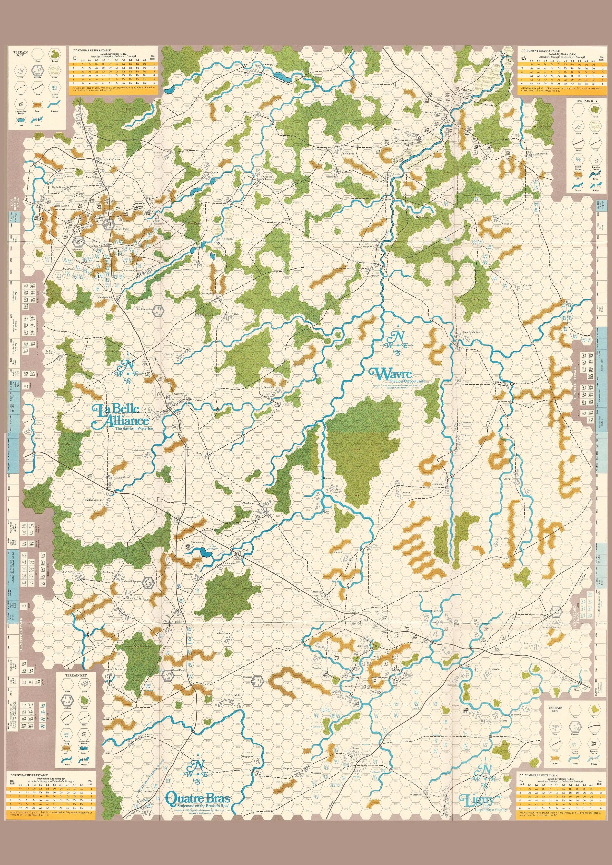
A beautiful map from the 1976 game Napoleon's Last Battles. Look at that gorgeous typeface used to title each zone, and how the various charts are nestled into the play area… makes my eyes feel good!